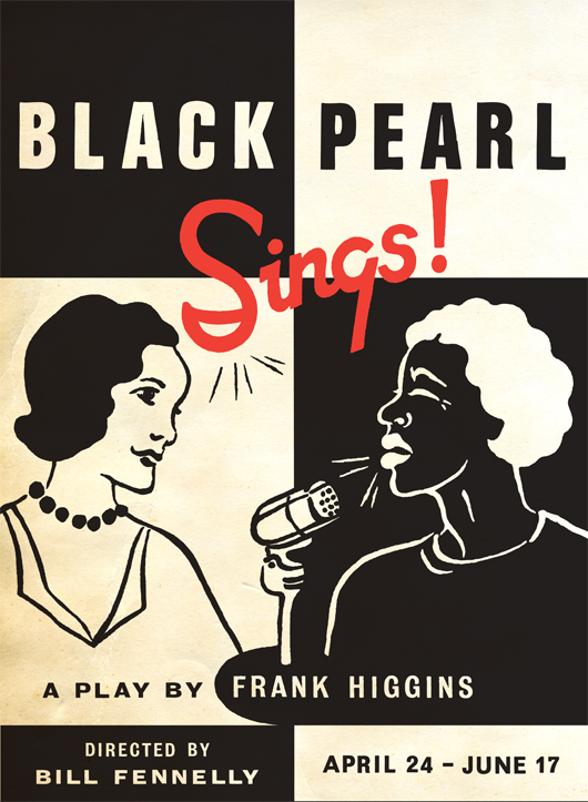
 Today I’d like to share a really fun, and quite different, project. I was contacted by Michael Buchino, the graphic designer for Portland Center Stage, to create a poster design for their 2012 season. The play was Black Pearl Sings!
A brief synopsis from Michael: In 1935 Texas, Susannah, an academic and song collector for the Library of Congress, visits a high-security prison where she meets Pearl, an African-American woman imprisoned for murder who longs to leave prison and find her lost daughter. Hoping to record the treasure trove of spirituals and African folk songs that only Pearl knows—and make her reputation on the discoveries—Susannah bargains for Pearl’s parole and arranges for several public performances. The two women soon find themselves walking a delicate line between exposure and exploitation.
Featuring beautiful a cappella renditions of little-known American folk songs, Black Pearl Sings! chronicles a powerful story about being a woman in a man’s world, being black in a white world, and fighting for one’s soul in a world where anyone can be a commodity.
I was very interested and excited to work on such a different type of project. I read the entire script and relished in trying to create a captivating and communicative image. I explored several different rough concepts and illustration styles.
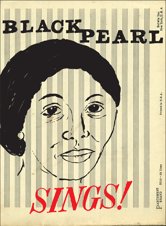
 Here is one of my studies. I thought it could be interesting to play with old sheet music paper and to use the lines to represent prison bars.
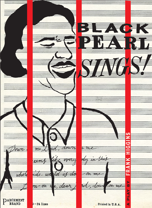
 Here is a similar study, again using the music paper, but here I wrote the words to a song that Pearl sings in prison to gather attention.
I loved keeping my designs in black and white with a touch of red, simplicity can be so powerful. The storyline and the main characters also made it seem quite fitting.
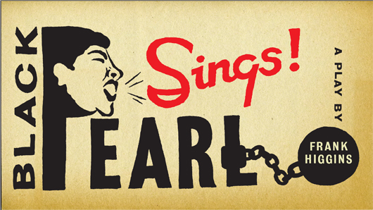
 I also explored “illustrated type”. I love expressive typography and I thought it could be interesting to illustrate the name of the play and somehow communicate the storyline.
 In the end Michael chose this design concept and I was very pleased. The final poster image, shown at the beginning of this post, evolved into a portrait format rather than landscape to accommodate other printed verbiage and I like the way it turned into a strong checkerboard of information. My illustration style in this design is inspired by one of my favorite artists of all time, Margaret Kilgallen. If you don’t know of her you should watch this short film. She was so talented. I love her work and sensibilities.
I love this image. So simple, so strong. Black, white, red. Very much reminiscent of the WPA era. It’s beautiful.
Thank you, Cynthia.
Thanks Michael! You were an absolute delight to work with!
Off the charts!!!!