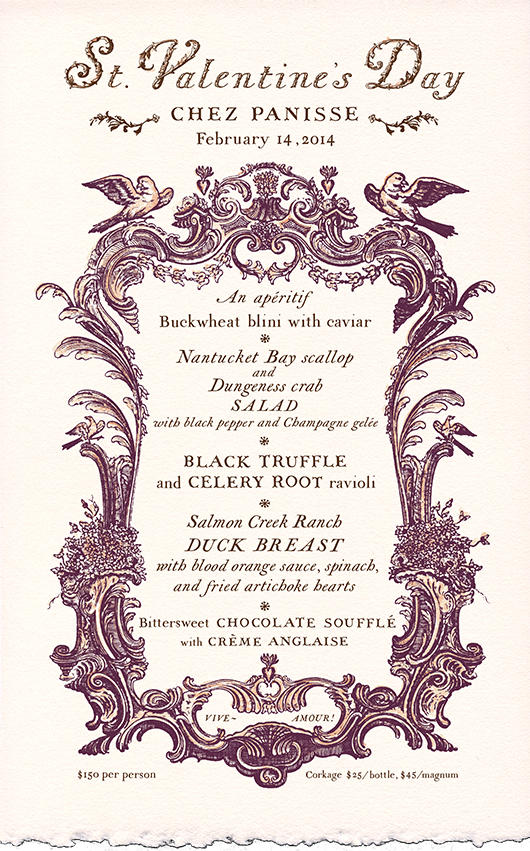
Please forgive my delayed Valentine's Day wishes, this year I was busily working on the menu designs for Chez Panisse Restaurant! Such a dream project! I created the above menus for the Downstairs Restaurant and the menu header, below, for the Café. My designs are inspired by gorgeous old title pages, in particular, design elements from Paris - circa the late 1700's. I … [Read more...]
Happy New Year!

Wow. I can't believe the holidays are already over and it's back to work in 2014! Life just seems to get faster and busier as each year passes, and with that said, my new year's resolution.. or hope... or mission is to make time to do creative projects purely for myself, for the simple joy of it, to inspire myself, and sometimes to collaborate and connect with the people I … [Read more...]
Northern California Fall Wedding
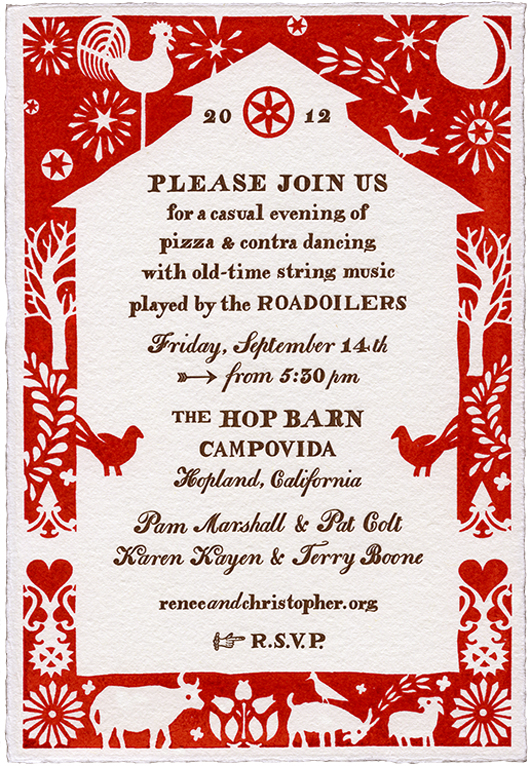
I just got home from a beautiful hike with a friend in Redwood Regional Park. I always love Thanksgiving weekend as it seems to be one of the rare times that life truly slows down. Being out in the woods on this crisp sunny day inspired me to share this autumnal wedding in Hopland, California. This is the same wedding that I spoke of in last month's post - Fall Wedding … [Read more...]
Fall Wedding Feast
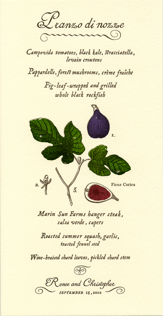
My mother just dropped off a bounty of delicious figs from her tree and it made me think of this menu that I created last year. Renee and Chris were a lovely couple getting married at Campovida, a magical family run organic farm and vineyard in Hopland, California. The Italian inspired wedding feast was served outdoors under the stars. As the menu featured fish grilled in fig … [Read more...]
Sweetest Birth Announcement
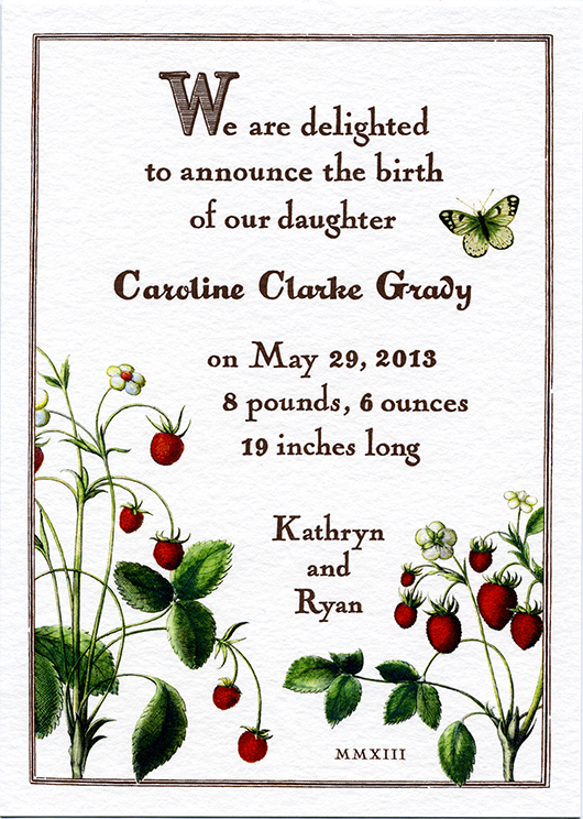
I've been wanting to share this sweet birth announcement for quite some time. I've known Kathryn, the client and expecting mother, for several years and was so honored when she contacted me regarding this very special project. Kathryn is the creator of Snippet & Ink, one of my most favorite wedding blogs. She has excellent taste, a great design eye, and a true appreciation … [Read more...]
- « Previous Page
- 1
- 2
- 3
- 4
- …
- 13
- Next Page »