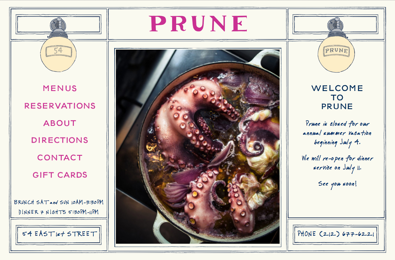
Today, I am overjoyed to make a long awaited announcement..... PRUNE Restaurant's new website is LIVE!! Sometime ago I was contacted by Tyla Fowler, assistant to Gabrielle Hamilton, and asked whether I'd be interested in redesigning Prune's website. Of course, my response was "Absolutely!". I remember when I first heard Gabrielle Hamilton on the radio, speaking about her … [Read more...]
Odile
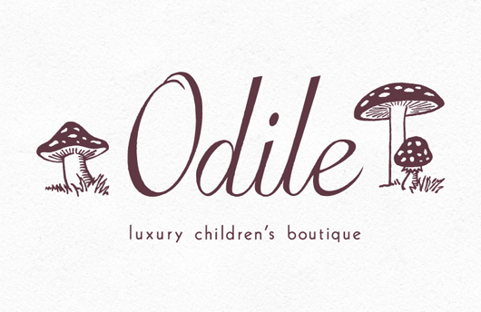
I am about to become an Auntie in a few weeks, so babies have been on my mind! And while I'm on the subject, I'd like to share a lovely "logo refresh" project that I did for Odile, a luxury children's boutique in Chicago's Gold Coast neighborhood. Camille Cozzini, the owner, already had her wordmark designed but felt it needed an illustrated element to reflect the kind of … [Read more...]
A Delicious Gift
Lately I seem to have Pizzaiolo, and their delicious food, on my mind... I think I need to go and visit! Above is one of the best gifts I can think of, a gift certificate that feeds you! I designed and hand-lettered this gift certificate several years ago and I still love it's simplicity and old world charm. I found the wood oven engraving in a book of mine and I think the … [Read more...]
Happy anniversary Pizzaiolo!
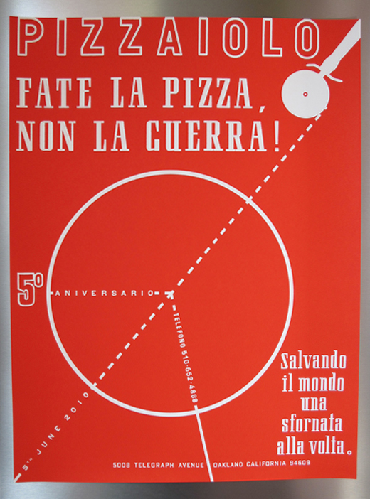
Pizzaiolo Restaurant just had it's sixth year anniversary! I have worked with Charlie, the owner, quite a bit on various projects. My favorite projects being the commemorative Anniversary Posters! Sadly, I did not create this year's poster due to my crazy schedule and timing. But I thought it was timely to share the poster I designed for last year's 5th anniversary. Please … [Read more...]
Punch Drunk Love
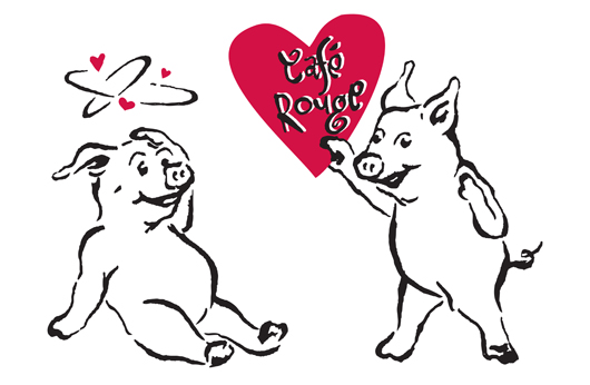
I always have fun working with Marsha McBride, the owner and chef at Cafe Rouge Restaurant (& Meat Market). She has a fantastic sense of humor so each project is guaranteed to make me smile. Here are two of the pig characters that I created for Cafe Rouge's house wine label some years ago. Over time we've been able to adapt these funny illustrations for all sorts of things; … [Read more...]