Two thousand & fifteen has arrived, and although the New Year always comes faster than I feel prepared for, I welcome it! This year, my personal aspirations are focused on embracing change and exploring new possibilities... pushing myself out of my comfort zone. Change doesn't tend to come easy but the beneficial energy and creativity that it can generate is powerful … [Read more...]
Birthday Party At The SF Jazz Center
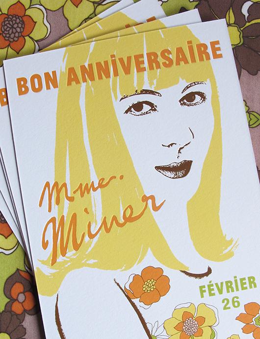
Recently I had the delightful opportunity to design an invitation, and day-of paper, for a very special birthday party held at the SF Jazz Center. Stanlee Gatti, event planner extraordinaire, designed the event. I was so thrilled when he contacted me regarding this project! The theme was 'Paris in the late sixties - early seventies', a time and place that was very memorable … [Read more...]
Martha Stewart Weddings – Summer Issue
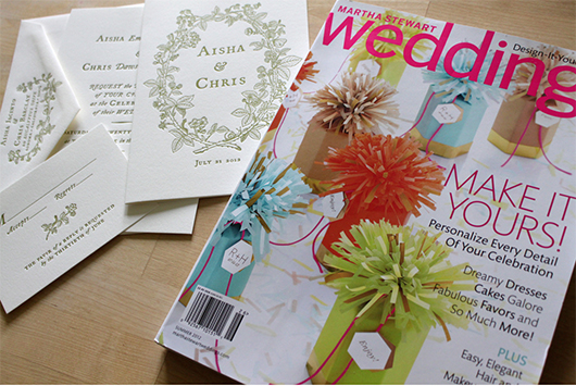
I have been dying to post about another amazing project for Martha Stewart Weddings, featured in their summer issue! I was contacted by the Martha Stewart design team to create a wedding suite inspired by berries! We decided to center the designs around a custom illustrated border that I had created. Here is our original inspiration, a wedding invitation that I created for Aya … [Read more...]
Black Pearl Sings!

Today I'd like to share a really fun, and quite different, project. I was contacted by Michael Buchino, the graphic designer for Portland Center Stage, to create a poster design for their 2012 season. The play was Black Pearl Sings! A brief synopsis from Michael: In 1935 Texas, Susannah, an academic and song collector for the Library of Congress, visits a high-security prison … [Read more...]
Odile
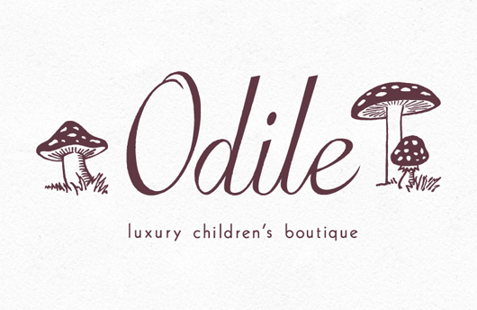
I am about to become an Auntie in a few weeks, so babies have been on my mind! And while I'm on the subject, I'd like to share a lovely "logo refresh" project that I did for Odile, a luxury children's boutique in Chicago's Gold Coast neighborhood. Camille Cozzini, the owner, already had her wordmark designed but felt it needed an illustrated element to reflect the kind of … [Read more...]
- 1
- 2
- 3
- 4
- Next Page »