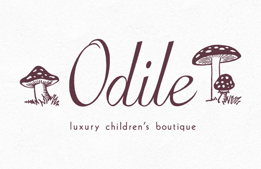
I am about to become an Auntie in a few weeks, so babies have been on my mind! And while I'm on the subject, I'd like to share a lovely "logo refresh" project that I did for Odile, a luxury children's boutique in Chicago's Gold Coast neighborhood. Camille Cozzini, the owner, already had her wordmark designed but felt it needed an illustrated element to reflect the kind of … [Read more...]
Happy Bastille Day!
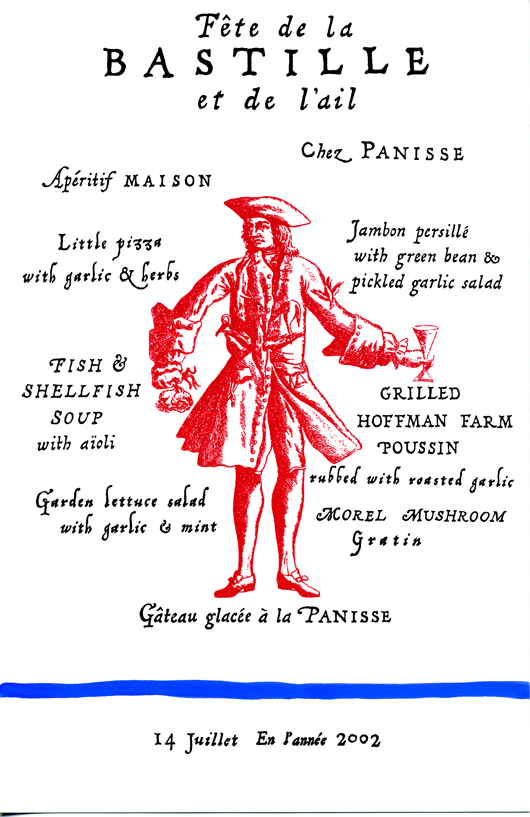
I've grown to love July 14th, Bastille Day, as it is such a magical night at Chez Panisse Restaurant. Over the years I have created many Bastille Day menus for Chez Panisse, the above 2002 menu was my first. At Chez Panisse, Bastille Day is also a celebration of the garlic harvest. The decorations that can be found all around the restaurant are breathtaking... beautiful garlic … [Read more...]
Happy anniversary Pizzaiolo!
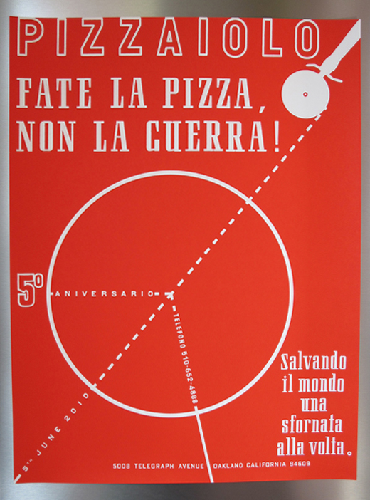
Pizzaiolo Restaurant just had it's sixth year anniversary! I have worked with Charlie, the owner, quite a bit on various projects. My favorite projects being the commemorative Anniversary Posters! Sadly, I did not create this year's poster due to my crazy schedule and timing. But I thought it was timely to share the poster I designed for last year's 5th anniversary. Please … [Read more...]
60th Birthday Dinner

I've been reorganizing my studio lately and sorting through drawers and drawers of my lateral files. I came across this menu that I created for a special birthday dinner at Chez Panisse Restaurant. A 60th birthday celebration for two of Alice's close friends. I love the charming, funny little morel mushrooms, photographs from one of Alice's books. Here is the back of the … [Read more...]
Special Delivery!

I wanted to share this birth announcement that I created for a friend/colleague. It is inspired by a wedding invitation design that I did, featured in Brides Magazine, last year. The theme was "vintage schoolhouse" printed on old school paper, mounted to old file folders, and packaged in manila envelopes. The look had such an old fashioned sweetness about it... also perfect for … [Read more...]