2015 - A Year To Flourish
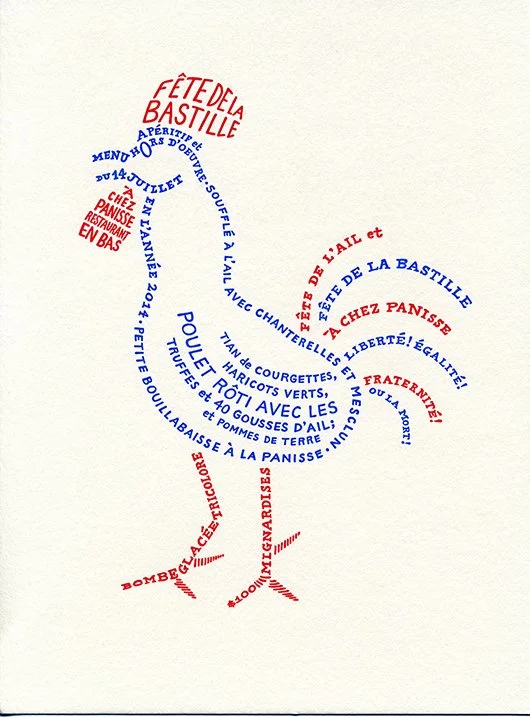
Calligram Menu For Chez Panisse
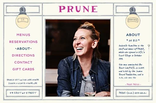
Prune Restaurant - Website!
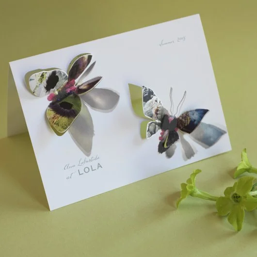
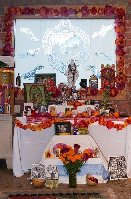
Art Opening Invitation For Ana Labastida
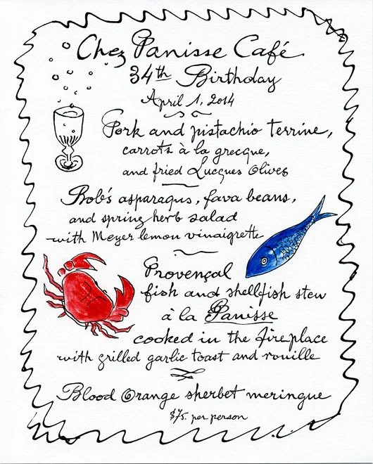
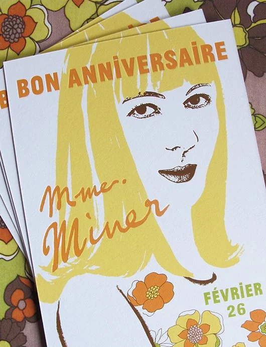
Bon Anniversaire Chez Panisse Café!
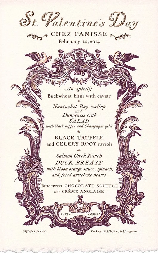
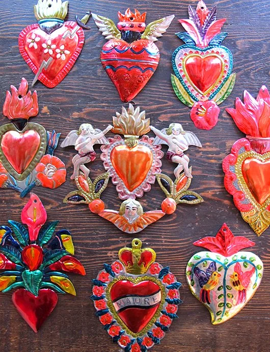
St. Valentine's Day at Chez Panisse

Happy New Year!
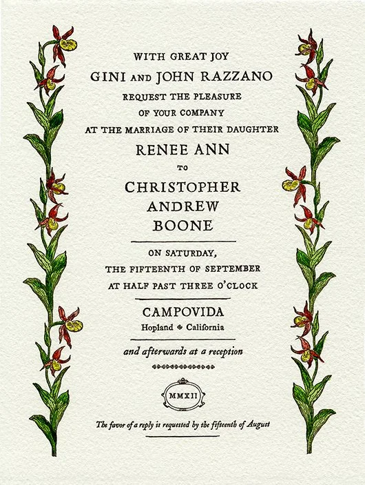
Northern California Fall Wedding
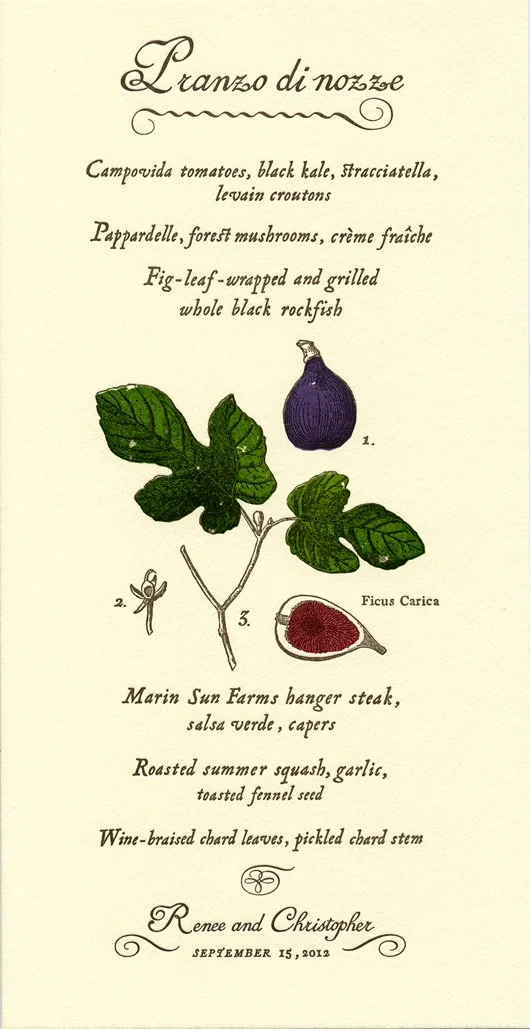
Fall Wedding Feast
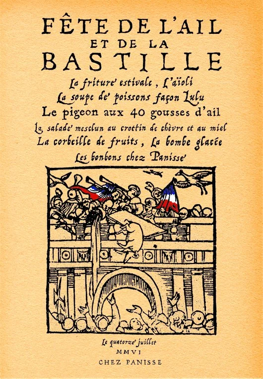
Vive Bastille Day! Vive Chez Panisse!
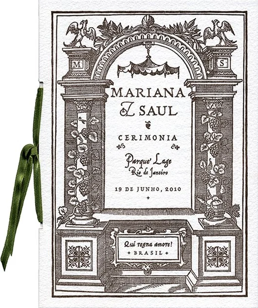
Wedding In Rio De Janeiro

Outdoor Wedding In Mendocino
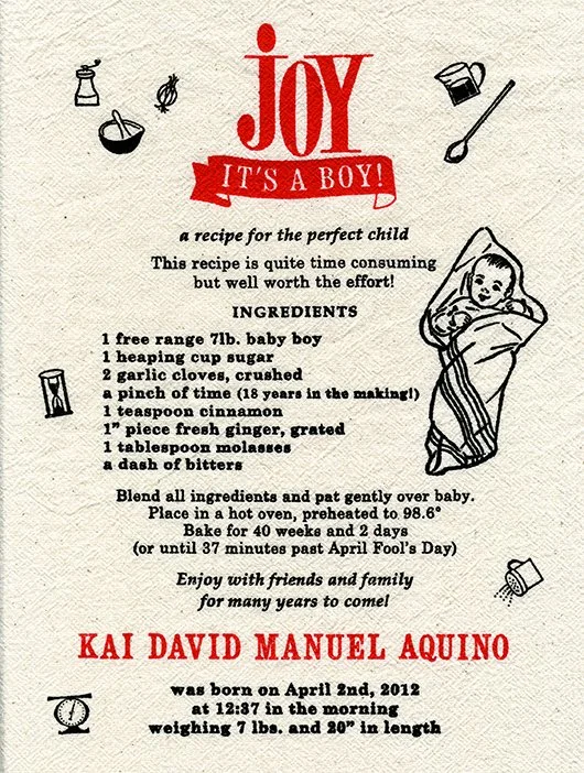
Joy, It's A Boy!
Birthday Party At The SF Jazz Center
Belated Valentine
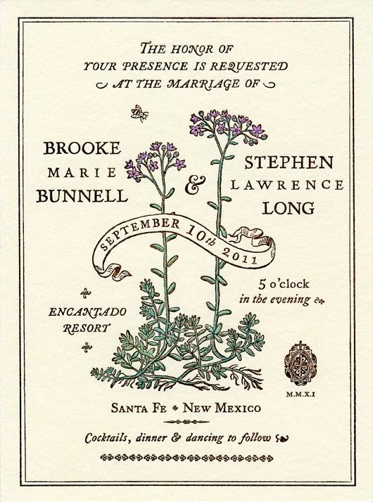
Brooke & Stephen - Santa Fe Wedding
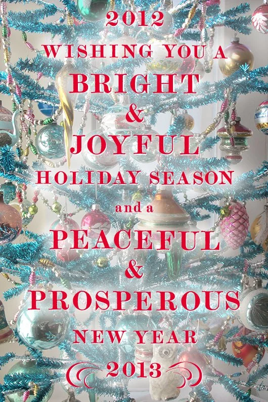
Holiday Wishes
Interview on design sponge!
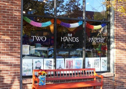
Two Hands Paperie