
With May Day just a few days ago, I feel like I've been hearing mention of maypoles everywhere. Fittingly, it has inspired me to create this post about a very special outdoor wedding in Mendocino, California. Andie, the bride, was such a delight to work with. She had wonderful ideas, lots of inspiration, and a fun and playful spirit. I was so inspired by her thoughtful … [Read more...]
Belated Valentine
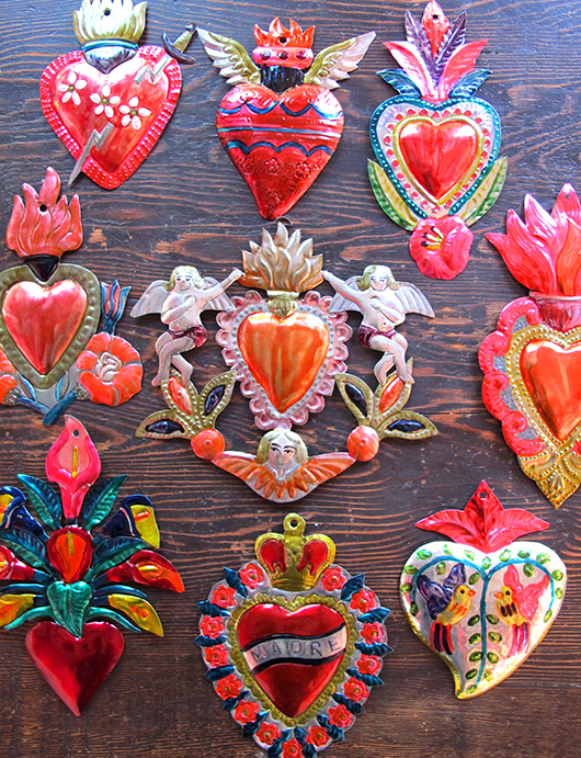
This year, for the first time ever, I did not celebrate Valentine's Day.... so sad! Marc and I had caught the most horrible flu, it truly knocked us down for over a week. Neither of us had ever been so sick. Needless to say, Valentine's Day came and went. Now that we've recovered I wanted to do a little something fun to mark the holiday... always a good excuse! Yesterday we … [Read more...]
Two Hands Paperie
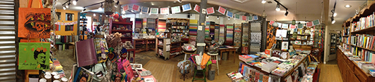
As a perfect follow up to my previous post on Day of the Dead, I thought I'd share a fun project that I did as a surprise for Two Hands Paperie. This gorgeous store is in historic downtown Boulder, Colorado and it is owned by one of my dearest friends, Mia Semingson, and her husband Gerald Trainor. Two Hands Paperie is such a magical place, full to the brim with decorative … [Read more...]
Laser Cutting Bliss!
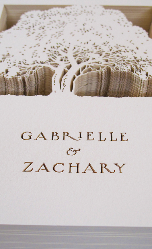
I recently completed a custom wedding invitation suite that incorporated laser cutting! I've been completely intrigued by laser cutting ever since my trip to New York for the National Stationary Show in May. There were several vendors at the show who specialized in laser cutting and all the samples I saw were very impressive. However, there was one vendor that really struck me, … [Read more...]
Shrine To Lola
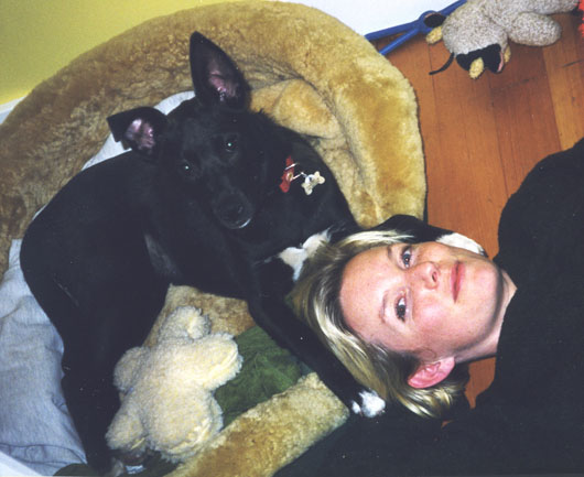
Today I've decided to write a very personal post. I realize this may be a bit inappropriate for a blog about my design projects and the way I work, however, I would feel uncomfortably strange to not mention the great loss I have recently suffered. On August 13th I made the decision to put Lola, my dog, down. It was the hardest thing I have ever done. Lola was my first... I had … [Read more...]
- « Previous Page
- 1
- 2
- 3
- 4
- …
- 6
- Next Page »