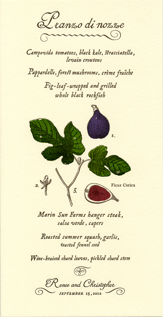
My mother just dropped off a bounty of delicious figs from her tree and it made me think of this menu that I created last year. Renee and Chris were a lovely couple getting married at Campovida, a magical family run organic farm and vineyard in Hopland, California. The Italian inspired wedding feast was served outdoors under the stars. As the menu featured fish grilled in fig … [Read more...]
Sweetest Birth Announcement
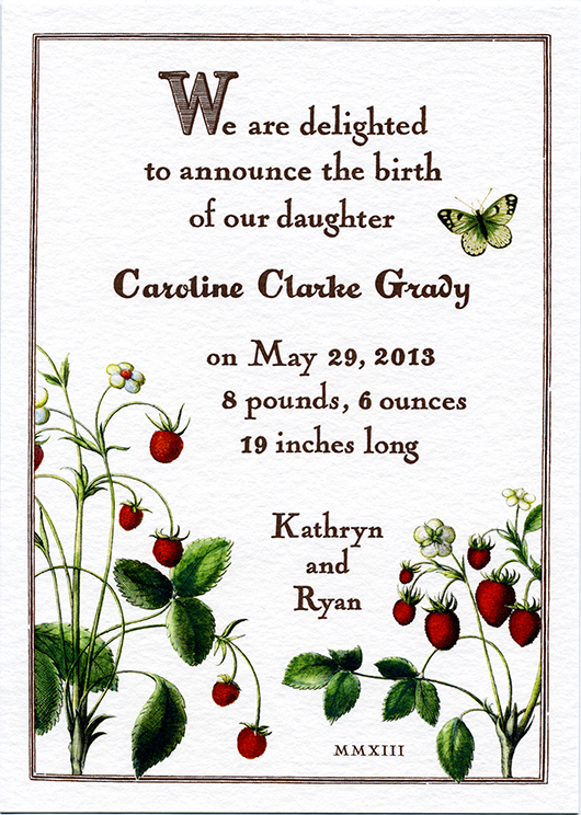
I've been wanting to share this sweet birth announcement for quite some time. I've known Kathryn, the client and expecting mother, for several years and was so honored when she contacted me regarding this very special project. Kathryn is the creator of Snippet & Ink, one of my most favorite wedding blogs. She has excellent taste, a great design eye, and a true appreciation … [Read more...]
42 Years of Chez Panisse
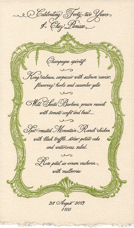
Yesterday Chez Panisse celebrated it's 42nd birthday. I have always felt a sense of kinship with the restaurant, as I too was born in 1971. I was so pleased when I was contacted to design and print the menus for this celebratory occasion. I kept my design simple and elegant using a decorative border from the late 1700's which I silkscreen printed in a soft moss green. I … [Read more...]
Vive Bastille Day! Vive Chez Panisse!
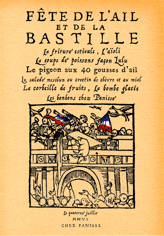
It seems impossible that we are already deep into July, where does the time go? Although I'm a little late, I thought I'd post another one of my Bastille Day menus designed for Chez Panisse Restaurant. I've created many special menus for Chez Panisse over the years and they continue to be some of my favorite projects of my career. Alice (the owner and guiding light of the … [Read more...]
Belated Valentine
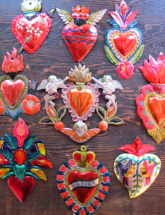
This year, for the first time ever, I did not celebrate Valentine's Day.... so sad! Marc and I had caught the most horrible flu, it truly knocked us down for over a week. Neither of us had ever been so sick. Needless to say, Valentine's Day came and went. Now that we've recovered I wanted to do a little something fun to mark the holiday... always a good excuse! Yesterday we … [Read more...]
- « Previous Page
- 1
- 2
- 3
- 4
- …
- 9
- Next Page »