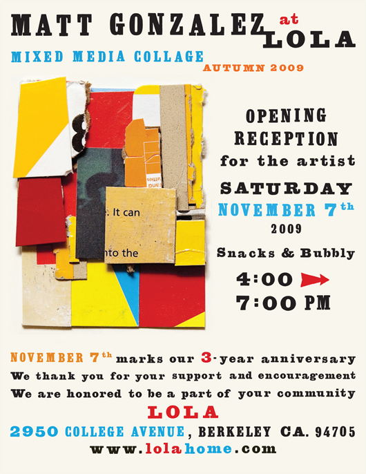
I recently came across this announcement/mailer in my archives and I was reminded of how much I love old wood type! Matt Gonzalez, among MANY other things, is a wonderful collage artist and Lola Home Store (which sadly closed last year) was showing his work and throwing a lively artist's reception. The colorful collage shown was one of my favorites in the exhibit and I felt … [Read more...]
Martha Stewart Weddings – Summer Issue
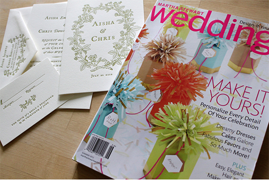
I have been dying to post about another amazing project for Martha Stewart Weddings, featured in their summer issue! I was contacted by the Martha Stewart design team to create a wedding suite inspired by berries! We decided to center the designs around a custom illustrated border that I had created. Here is our original inspiration, a wedding invitation that I created for Aya … [Read more...]
Black Pearl Sings!

Today I'd like to share a really fun, and quite different, project. I was contacted by Michael Buchino, the graphic designer for Portland Center Stage, to create a poster design for their 2012 season. The play was Black Pearl Sings! A brief synopsis from Michael: In 1935 Texas, Susannah, an academic and song collector for the Library of Congress, visits a high-security prison … [Read more...]
Roses are Red, Violets are Blue…
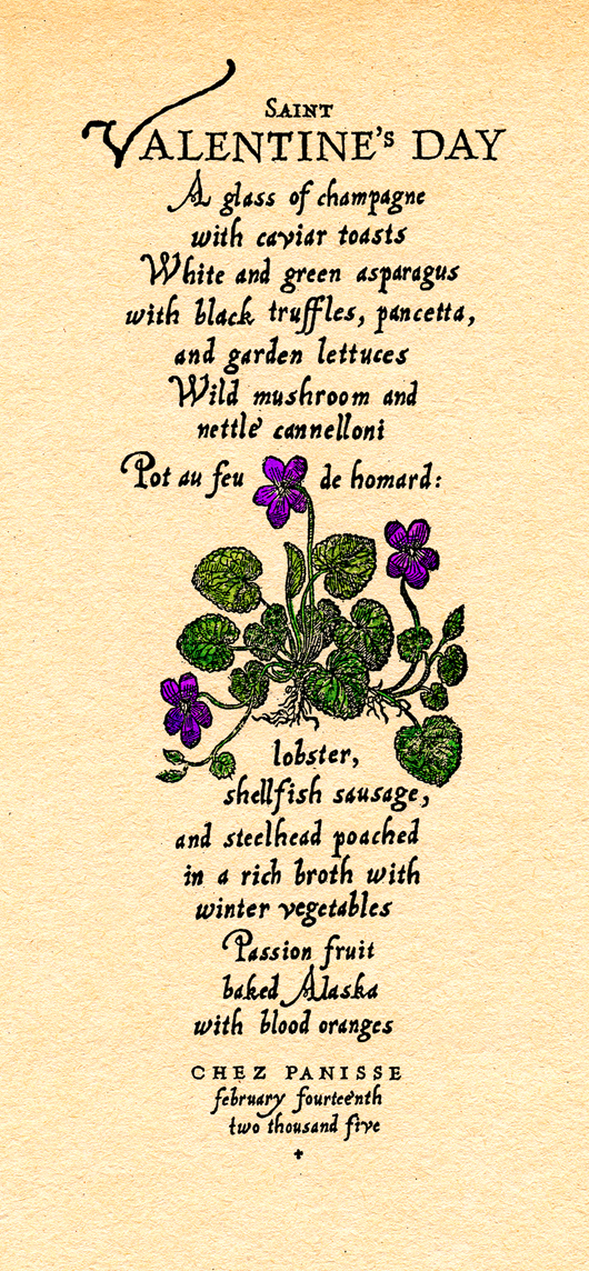
Oh how I love Valentine's Day! Such a great excuse to pause for a moment, remember the ones we love, and create something... a note, a card, a piece of art.... to express our feelings and appreciation. This Valentine's I thought I'd post about a sweet menu that I created for Chez Panisse Restaurant. Alice, the owner, created a wonderful tradition of giving each couple, dining … [Read more...]
Spring Wedding

I took a walk this morning with my dog, Lola, and was astounded by the cherry/plum blossom trees in my neighborhood! They were full of blooms and the scent in the air was so fresh and alive, it made me think of the wedding suite I designed for Bridget & Peter. Bridget wanted to do an early spring theme for her wedding. She told me "...springtime in New York... the plum and … [Read more...]
- « Previous Page
- 1
- 2
- 3
- 4
- 5
- …
- 9
- Next Page »